
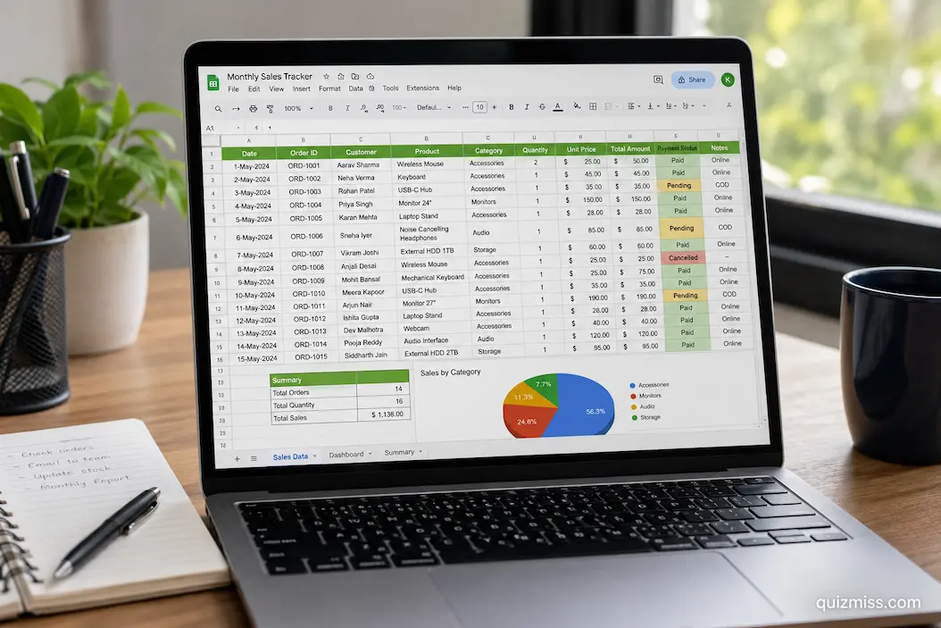
A spreadsheet with 50 rows can feel effortless to use. You know where the information is stored, which formulas matter, and where to look when something needs to be changed. The same workbook can feel very different after several thousand rows have been added.
As data grows, scrolling becomes slower, formulas become harder to review, and finding a particular record may require several searches or filters. New worksheets may appear, additional columns may be added, and different people may begin using the file in different ways. What started as a simple spreadsheet can gradually become a complicated working system.
The problem is not necessarily the number of rows. A large workbook can remain manageable when its structure supports growth. On the other hand, even a relatively small workbook can become difficult when information is scattered, formulas are inconsistent, and old sections are never reviewed.
Large workbooks need to be designed and maintained differently from temporary spreadsheets. The goal is not simply to store more information. It is to keep that information accessible, consistent, and useful as the workbook continues to expand.
Understand When a Workbook Is Starting to Outgrow Its Original Design
There is no single row count at which a spreadsheet suddenly becomes too large. A workbook may become difficult to manage because of its number of records, the number of formulas it contains, the number of worksheets, the complexity of its calculations, or the number of people editing it.
Some warning signs are easier to notice than others. You may be dealing with a growing-workbook problem when:
- Finding a record requires extensive scrolling.
- Users repeatedly create temporary copies of the same data.
- New columns are added whenever a new requirement appears.
- Similar information exists in several worksheets.
- Formulas become difficult to understand.
- Reports need frequent manual adjustments.
- The workbook takes noticeably longer to open or calculate.
- Users are unsure which worksheet contains the current information.
- Old records remain mixed with active data without a clear reason.
- Adding new records requires changing existing formulas or layouts.
These signs do not automatically mean that the workbook needs to be replaced. They indicate that its current structure may need attention.
Keep Growing Records in One Consistent Data Area
One of the most important principles for a large workbook is keeping similar records in a predictable structure. If every row represents one record and every column represents one attribute, the dataset can grow without requiring a new layout for every month, department, or category.
For example, an order-tracking workbook might use columns such as
| Order ID | Order Date | Customer | Category | Status | Amount |
|---|---|---|---|---|---|
| 1001 | Jan 12 | Sarah | Electronics | Completed | 245 |
| 1002 | Jan 13 | Daniel | Office | Pending | 98 |
| 1003 | Jan 14 | Emma | Home | Shipped | 175 |
When another order arrives, it becomes another row.
This is generally easier to manage than creating separate sections for January, February, March, and so on. A continuous dataset makes filtering and reporting more straightforward as the number of records increases.
The important principle is simple: growth should add records, not repeatedly change the structure.
Avoid Creating New Columns for Every New Question
Adding a column can seem like the easiest way to accommodate new information. Sometimes it is the correct solution. But if a workbook accumulates new columns every time someone asks a slightly different question, the table can eventually become expansive.
An expansive table creates its own problems. Users must scroll horizontally, related information becomes harder to compare, and important fields may disappear far outside the visible area.
Before adding a column, consider whether the information is genuinely part of the record. For example, a customer table might reasonably contain a customer type, registration date, region, and account status. But creating separate columns for every possible note, temporary classification, or one-time observation can make the structure increasingly difficult to maintain. New information should serve a clear purpose and maintain a consistent relationship with the records already stored.
Keep Each Column Focused on One Type of Information
Large datasets become much easier to manage when each column has a predictable meaning.
A column called “Customer” should not contain customer names in some rows and notes about customers in others. A “Date” column should contain dates rather than a mixture of dates and explanatory comments. This matters more as the dataset grows because inconsistent columns make filtering and analysis increasingly unreliable.
A useful test is to ask:
What question does this column answer?
If every value in the column answers the same question, its purpose is probably clear. If the meaning changes depending on the row, the structure may need to be reconsidered.
Use Tables or Structured Data Ranges
When a workbook is expected to grow continuously, the data area should be designed to accommodate additional records. A structured table can make this easier because new rows can become part of the dataset without requiring users to manually rebuild ranges each time.
This is particularly useful when formulas, filters, sorting, or summary calculations depend on the data. Instead of designing calculations around an assumption such as “there will only be 500 rows,” create a structure that can accommodate additional records. The exact method depends on the spreadsheet application being used, but the principle is the same: new data should fit into the existing structure with minimal manual intervention.
Separate Active Data From Historical Information When Necessary
A growing workbook does not always need to keep every record in the same active worksheet forever. Older information can eventually make the main working area unnecessarily large, particularly when users rarely need to edit historical records.
An archive can help when there is a genuine distinction between active and historical information.
For example:
- Current-year transactions can remain in the active dataset.
- Previous years can be moved to clearly labeled archive sheets or files.
- Completed projects can be separated from current projects.
- Closed records can be retained without cluttering daily workflows.
The important part is preserving access to historical information while preventing it from interfering with everyday work.
Archiving should not mean casually deleting old records. Historical information may still be required for reporting, comparison, auditing, or reference.
Separate Raw Data From Reports
Large workbooks often become difficult to maintain when raw records and presentation elements occupy the same area. A better approach is to give different parts of the workbook distinct responsibilities.
For example:
| Area | Purpose |
|---|---|
| Raw Data | Stores original records |
| Calculations | Performs supporting calculations |
| Summary | Presents important totals |
| Reports | Provides detailed analysis |
| Archive | Stores historical information |
| Reference | Contains supporting lists and values |
This separation becomes increasingly useful as the workbook grows. Users entering information can work with the data area without accidentally changing a report. People reviewing results can use summary sheets without navigating through thousands of records.
Design Formulas for Expansion
A formula that works correctly today may not work correctly after thousands of new records are added. One common problem occurs when a calculation uses a fixed range that does not automatically expand.
For example, a total may originally calculate from rows 2 through 500. If the dataset later grows to 5,000 rows but the formula still stops at row 500, the result will be incomplete without necessarily producing an obvious error.
When reviewing formulas in a growing workbook, ask:
- Will this calculation include future records?
- Does the range expand when new rows are added?
- Are formulas copied consistently?
- Could a user accidentally overwrite the formula?
- Are there unnecessary references to fixed cells?
- Does the calculation still work after sorting or filtering?
The objective is to make formulas as simple as possible. It is to make them dependable as the workbook grows.
Use Helper Columns When They Improve Clarity
Large workbooks sometimes contain extremely long formulas designed to perform many operations at once. Although a single formula may appear efficient, it can be difficult to understand and troubleshoot.
Helper columns can divide a complicated calculation into smaller steps. For example, instead of calculating a final value through one long formula, the workbook might separately calculate:
- The base amount.
- The adjustment.
- The applicable rate.
- The final amount.
This method adds a few columns but can make the calculation easier to inspect. The best structure depends on the workbook, but readability becomes increasingly valuable as more people interact with a growing file.
Make Searching and Filtering Part of the Normal Workflow
Scrolling through thousands of rows is not an efficient way to work with a large dataset. Search, filters, sorting, and other navigation features should become part of the normal workflow. For example, instead of manually locating every transaction for a particular customer, filter the customer column. Instead of scrolling through an entire year of records, filter the relevant date range.
Useful filtering fields often include:
- Date.
- Status.
- Category.
- Customer.
- Department.
- Location.
- Priority.
- Record type.
The exact fields depend on the purpose of the workbook. A large dataset becomes much more manageable when users can narrow thousands of records down to the few they actually need.
Keep Headers Visible While Scrolling
When a worksheet contains thousands of rows, users can quickly lose track of what each column represents. Keeping the header row visible while scrolling is a small change that makes a major difference.
Without visible headers, someone may have to scroll back to the top repeatedly to remember whether a particular column contains order dates, delivery dates, costs, or quantities. For frequently used large tables, frozen headers are one of the simplest ways to improve navigation.
Be Careful With Excessive Formatting
Large workbooks often accumulate excessive formatting. A few thousand rows with unnecessary borders, colors, fonts, and formatting rules can make the workbook harder to manage and may contribute to slower performance.
Formatting should communicate useful information. For example, conditional formatting can be valuable for identifying overdue tasks or unusually low inventory. But applying multiple formatting rules across enormous unused ranges creates unnecessary complexity.
A good rule is to format the information users need to understand rather than decorating every available cell.
Watch for Unused Rows, Columns, and Formatting
A workbook may appear to contain 5,000 records while actually carrying formatting or formulas across tens of thousands of additional cells.
Unused content can accumulate gradually. Someone may copy formatting far below the current dataset. Another user may add formulas to an entire column. Temporary information may remain hidden outside the main working area.
Periodically review the workbook for:
- Unused worksheets.
- Empty but heavily formatted areas.
- Obsolete formulas.
- Duplicate tables.
- Temporary calculations.
- Old report sections.
- Unnecessary named ranges or references.
Cleaning these areas can make the workbook easier to navigate and maintain.
Avoid Repeating the Same Information
Growing workbooks often develop duplicate information because users want different worksheets to be convenient. For example, the same customer details might be copied into a sales sheet, support sheet, reporting sheet, and monthly summary.
This creates a maintenance problem. If the customer’s information changes, several copies may need to be updated. Eventually, different worksheets can contain conflicting versions of the same information. Whenever practical, store important information in one appropriate location and reference it elsewhere.
This reduces duplication and makes updates more predictable.
Use Consistent Data Validation
As more people enter information, the chance of inconsistent entries increases.
One person may enter “Complete,” another may enter “Completed,” and another may use “Done.” A spreadsheet can treat these as three different values even though they represent the same status. Data validation can reduce this problem. For fields with a limited number of acceptable values, use controlled choices where appropriate.
Examples include:
| Field | Suitable Control |
|---|---|
| Status | Approved list of statuses |
| Department | Defined department list |
| Category | Standard category list |
| Priority | Low, Medium, High |
| Quantity | Numeric restriction |
| Date | Valid date range |
Consistency becomes increasingly important as the number of records and contributors increases.
Make Important Assumptions Easy to Find
Large workbooks often contain values that influence calculations throughout the file.
Examples include:
- Tax percentages.
- Exchange rates.
- Standard prices.
- Target values.
- Discount rates.
- Reporting dates.
- Hourly rates.
If these values are scattered throughout formulas, updating them becomes difficult. A dedicated assumptions or reference area can make the workbook easier to maintain. Instead of changing the same value inside dozens of formulas, the workbook can use a central value where appropriate. This also makes it easier for another person to understand what affects the calculations.
Think Carefully Before Adding More Worksheets
Adding another worksheet can temporarily solve a problem. Over time, however, a workbook containing dozens of worksheets can become difficult to navigate. Before creating a new worksheet, ask whether the information genuinely requires a separate area.
A new sheet may make sense when the information has a distinct purpose, such as a report, archive, reference list, or separate dataset. It may be unnecessary when it simply duplicates information that already exists elsewhere. Meaningful worksheet names are also important. Names such as “Current Orders,” “Archive 2025,” and “Monthly Summary” are much easier to understand than “Sheet7,” “New Data,” or “Final2.”
Consider Performance as Data Volume Increases
A growing workbook may eventually become slower. The cause can be anything from large formulas and excessive formatting to extensive conditional formatting, external references, or calculations repeated unnecessarily across large ranges.
If performance begins to decline, investigate the workbook instead of simply accepting the slowdown.
Look for:
- Calculations repeated unnecessarily.
- Very large formatting ranges.
- Unused formulas.
- Excessive conditional formatting.
- Unnecessary external links.
- Duplicate datasets.
- Old worksheets that are no longer required.
Not every slow workbook has the same cause, so performance problems should be investigated rather than solved by blindly deleting information.
Test the Workbook After Major Structural Changes
Large workbooks are particularly sensitive to structural changes. Adding a column, moving a worksheet, changing a formula, or replacing source data can affect calculations elsewhere. After making an important change, check the areas most likely to be affected.
For example, after adding a new field to a dataset, verify:
- Important formulas still work.
- Reports include the new data where appropriate.
- Filters still behave correctly.
- Charts use the intended ranges.
- Summary figures remain accurate.
Making changes gradually also makes problems easier to identify.
If you make ten major changes simultaneously and something breaks, it can take much longer to find the cause.
Create a Simple Maintenance Routine
Large workbooks benefit from regular maintenance rather than occasional emergency cleanup.
The exact schedule depends on how frequently the workbook changes, but a basic review can include:
Weekly or Regular Review
Please review recently added records, unusual values, and any obvious formula problems.
Monthly Review
Look for duplicate information, unnecessary additions, inconsistent entries, and outdated temporary sections.
Periodic Structural Review
Examine worksheets, formulas, data ranges, reports, and archive arrangements to determine whether the workbook still supports its current workload.
The purpose of this routine is not to constantly redesign the spreadsheet. It is to prevent small problems from accumulating unnoticed.
Know When a Workbook Needs More Than Cleanup
Sometimes a growing workbook has reached a point where reorganizing it is no longer enough.
Warning signs can include:
- Many people need to edit it simultaneously.
- The workbook contains extremely complex calculations.
- Users regularly create separate copies to avoid conflicts.
- The file has become difficult to open or update.
- Data is being entered through many disconnected processes.
- The same information must be maintained in several places.
- Reporting requires extensive manual preparation.
- The workbook is being used as a substitute for a dedicated database or business system.
This does not mean that a spreadsheet is inherently unsuitable. It means the original tool may no longer match the scale or complexity of the task.
Before making a major change, understand the actual problem. Sometimes better organization is enough. In other cases, a database, dedicated application, or other system may be more appropriate.
A Practical Large-Workbook Review
When a workbook has grown substantially, use a structured review rather than trying to inspect everything at once.
| Area | Questions to Ask |
|---|---|
| Data | Are records complete and consistent? |
| Structure | Can new records be added without redesigning the table? |
| Columns | Does every column have a clear purpose? |
| Formulas | Do important calculations still cover current data? |
| Worksheets | Does every sheet still serve a useful purpose? |
| Reports | Are summaries and charts using current information? |
| Navigation | Can users find records without excessive scrolling? |
| Performance | Does the workbook still respond reasonably? |
| Duplication | Is the same information stored in multiple places? |
| Archive | Is historical information separated appropriately? |
| Validation | Are users prevented from entering common invalid values? |
| Documentation | Can someone unfamiliar with the workbook understand its structure? |
This review does not need to be completed every time a new row is added. It becomes most useful when a workbook has undergone substantial growth or when users begin reporting difficulties.
The Goal Is Controlled Growth
A large spreadsheet does not automatically become a bad spreadsheet. The real problem occurs when the workbook grows in ways that its original structure cannot support. Adding another thousand records should ideally mean adding another thousand records—not creating another collection of special sections, duplicate tables, manual calculations, and temporary worksheets.
Controlled growth means keeping the underlying structure stable while allowing the amount of information to increase. That requires planning, but it also requires periodic maintenance. A workbook that was well designed when it contained 500 records may need adjustments when it reaches 5,000. Those adjustments should improve the existing structure rather than introduce unnecessary complexity.
Conclusion
Large workbooks require more than simply adding more rows to an existing spreadsheet. As information grows, the structure must continue to support searching, filtering, calculation, reporting, and maintenance without creating unnecessary work.
The most important principle is to allow the data to grow without constantly changing the structure. Keep records in consistent tables, give columns clear purposes, separate raw information from reports, design formulas for expansion, control duplicate information, and maintain a clear archive when historical data no longer belongs in the active workflow. Regular maintenance is equally important. A workbook that was manageable at 500 rows may need a structural review at 5,000 rows, especially if several people are using it or new requirements have been added.
The objective is not to keep a spreadsheet small. It is to make sure that growth does not make the workbook confusing, fragile, or unnecessarily difficult to use. With a stable structure and sensible maintenance habits, a spreadsheet can continue to handle substantially more information without losing the clarity that made it useful in the first place.
FAQs
1. How many rows can a spreadsheet handle comfortably?
There is no universal row count at which every spreadsheet becomes difficult to use. Practical limits depend on the spreadsheet application, formulas, formatting, number of worksheets, and overall complexity. A well-structured workbook can handle a substantial amount of information, while a poorly designed one can become difficult much earlier.
2. Should I create a new worksheet every time the data grows?
Usually, no. If the new information follows the same structure as the existing records, adding it to the existing dataset is often easier to manage. Separate worksheets are more appropriate when the information has a genuinely different purpose, such as reporting, reference data, or historical archives.
3. How can I make a 5,000-row spreadsheet easier to navigate?
Use filters, meaningful column headings, frozen headers, consistent data structures, and search tools. Avoid relying on manual scrolling to find individual records.
4. Should old data be removed from a large workbook?
Not automatically. Historical information may still be useful. Instead of deleting it simply to reduce the workbook’s size, consider whether it can be moved into a clearly labeled archive while keeping active information easier to manage.
5. Why does a spreadsheet become slow as it grows?
Several factors can contribute to slower performance, including large formulas, excessive formatting, conditional formatting across large ranges, external references, duplicated calculations, and unnecessary content. The cause should be identified before removing data or restructuring the workbook.
6. When should a spreadsheet be replaced with another system?
Consider another solution when the workbook has become difficult to maintain because of its number of users, complexity, performance requirements, repeated data, or dependence on manual processes. The decision should be based on the actual requirements rather than the number of rows alone.