
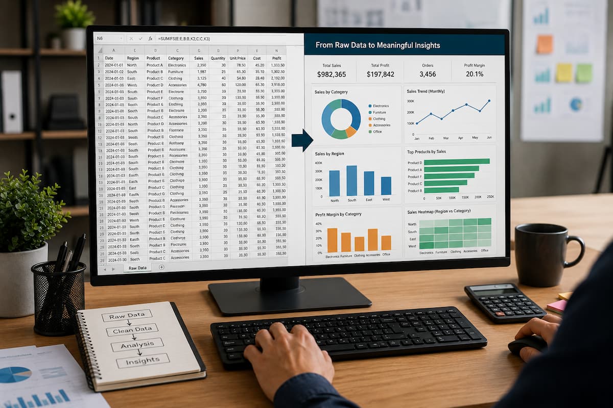
A spreadsheet full of numbers can contain valuable information, but raw data alone does not always communicate a clear message. A person looking at hundreds of rows may understand the details, but they may struggle to quickly identify trends, comparisons, or important changes. Charts solve this problem by turning numbers into visual information. A well-designed chart can show growth, problems, patterns, and relationships within seconds. A manager can understand sales performance, a student can explain research results, and a business owner can identify important trends without reading every individual value.
However, creating a chart is not simply about clicking the Insert Chart button in Excel. A poor chart can make information harder to understand. Too many colors, unnecessary effects, incorrect chart types, and confusing labels can hide the message instead of explaining it. The best charts are not the ones with the most decoration. They are the ones who communicate information clearly. Excel provides many chart options, but learning how to choose, design, and improve them is what turns a basic spreadsheet into a professional report.
Start With the Question Your Chart Should Answer
Before creating any chart, decide what information you want people to understand. Many beginners create charts first and consider the purpose later. This often leads to unnecessary visuals that do not provide useful information.
A better approach is to ask:
What decision should this chart help someone make?
For example:
A sales manager may want to know the following:
Are sales increasing over time?
- Which products perform best?
- Which regions need improvement?
A chart should answer one clear question instead of showing every available piece of information. If you want to compare products, a bar chart may be useful. If you want to show changes over months or years, a line chart may be better. If you want to show a relationship between two values, a scatter chart may provide more insight. The purpose of the chart should determine the design, not the other way around.
Choosing the Right Chart Type for Your Data
Excel offers many chart types, but each one works best for specific situations.
Use Column and Bar Charts for Comparisons
Column charts are among the most commonly used Excel charts, as they make comparisons easy.
For example, imagine a report showing monthly sales:
| Month | Sales |
|---|---|
| January | 5000 |
| February | 6500 |
| March | 8000 |
A column chart quickly shows which months performed better. Bar charts work similarly but display information horizontally. They are often better when category names are long.
For example:
- Product names
- Department names
- Customer categories
A common mistake is using pie charts when a bar or column chart would communicate the information better. When people need to compare several values, bars are usually easier to read.
Use Line Charts to Show Trends
Line charts are ideal when time is involved.
They help answer questions like
- Is revenue increasing?
- Are website visitors growing?
- Are expenses changing?
For example, a yearly sales report becomes much easier to understand when displayed as a line.
A table may show:
January: 4,000
February: 4,500
March: 5,200
April: 6,000
A line chart immediately shows upward movement. Line charts are especially useful for identifying patterns, but avoid using them for unrelated categories. Connecting unrelated values with a line can create a misleading impression.
Use Pie Charts Carefully
Pie charts show parts of a whole.
For example:
A company’s budget distribution:
- Marketing: 40%
- Operations: 35%
- Research: 25%
A pie chart can work well when there are only a few categories. However, pie charts become difficult to read when there are many sections. If your chart contains ten different categories with similar percentages, a bar chart will usually communicate the information more clearly.
Prepare Your Data Before Creating Charts
A professional chart begins with organized data. Excel charts depend on the structure of your spreadsheet. If your data is messy, the chart may also be confusing.
Before creating a chart:
- make sure every column has a clear heading
- remove unnecessary empty rows
- check for duplicate information
- confirm numbers are stored correctly
- keep related information together
For example, this structure works well:
| Month | Revenue | Expenses |
|---|---|---|
| January | 5000 | 3000 |
| February | 6000 | 3500 |
| March | 7000 | 4000 |
Excel can easily understand the relationship between these columns. A common mistake is selecting random cells from different areas of a worksheet. Often, this results in charts that have missing labels or incorrect categories. Using Excel tables is helpful because charts automatically update when new rows are added.
Create Your First Professional Chart in Excel
Creating a chart is simple:
- Select your data range.
- Open the Insert tab.
- Choose the appropriate chart type.
- Excel creates the chart automatically.
- Adjust the design and labels.
The first chart Excel creates is usually a starting point, not the final version.
You should review:
- chart title
- axis labels
- colors
- data labels
- unnecessary elements
A chart should help someone understand information without requiring additional explanation.
Improve Charts With Clear Titles and Labels
A chart title is one of the most important elements because it tells viewers what they are looking at.
Weak title:
“Sales Chart”
Better title:
“Monthly Sales Growth During 2026”
The second title provides context immediately.
Labels also matter.
If someone cannot understand the measurement units, the chart becomes confusing.
For example:
Instead of:
Revenue
Use:
Revenue ($)
Instead of:
Customers
Use:
Number of New Customers
Small improvements like these make charts much easier to understand.
Avoid Common Chart Design Mistakes
Many spreadsheet charts become confusing because of unnecessary design choices. One common mistake is using too many colors. A chart with ten different colors may look attractive, but it forces viewers to constantly check the legend. A better approach is using color only when it provides meaning.
For example:
- one color for normal values
- one color for important values
- one color for warnings
Another mistake is adding too many visual effects. Three-dimensional charts, shadows, and excessive decoration may look impressive, but they often reduce clarity. Professional charts usually use simple designs because the goal is communication, not decoration. Another problem is displaying too much information. A chart with dozens of categories may become unreadable. Sometimes the best solution is creating multiple smaller charts instead of one overloaded chart.
Use Data Labels When They Add Value
Data labels display exact values directly on charts. They are useful when viewers need specific numbers. For example, a sales report may benefit from showing the exact revenue amount above each column. However, adding labels everywhere can make charts crowded.
Use them when:
- there are only a few data points
- exact numbers matter
- the audience needs precise information
Avoid them when they create unnecessary visual noise.
Create Interactive Charts With Filters and PivotCharts
For larger datasets, static charts may not be enough. Excel PivotCharts allow users to interact with information by filtering and changing views.
For example, a company dashboard may allow users to view the following:
- sales by region
- sales by employee
- sales by product category
Instead of creating separate charts for every situation, one interactive chart can provide multiple perspectives. PivotCharts work best when you combine them with PivotTables, because they let you summarize large amounts of information visually.
Use Conditional Formatting Before Creating Charts
Occasionally, a chart is not the best solution. For smaller datasets, conditional formatting may communicate information faster.
For example, a performance table may use color indicators to show:
- high values
- low values
- missing information
A chart is useful when you need to explain relationships or trends. When you need to quickly identify important cells, conditional formatting is a useful tool. Choosing the right tool improves the quality of your spreadsheet.
Creating Charts That Work for Presentations and Reports
Charts used in presentations need to be especially clear because viewers may only see them for a few seconds. Avoid charts that require a long explanation.
A clear presentation chart should communicate the following:
- the main trend
- The important comparison
- The key conclusion
For example, instead of showing every monthly transaction, show monthly revenue growth. Instead of displaying every customer record, show customer growth trends. The purpose is not hiding information. It is presenting the most important information clearly.
Troubleshooting Common Chart Problems
Sometimes Excel charts do not display information correctly. One common issue is missing data.
If Excel creates an empty chart, verify whether:
- the selected range contains values
- numbers are stored as text
- the chart source is correct
Another problem is incorrect categories. For example, Excel may use row numbers instead of months if the data selection is incorrect.
You can resolve the issue by:
- Right-clicking the chart.
- Selecting Select Data.
- Adjusting the chart range and labels.
If your chart does not update after changing data, verify whether the source range includes the new information. Using Excel tables can prevent many update problems because they expand automatically.
FAQs
1. What is the best chart type for beginners?
Column charts and bar charts are usually the easiest starting points because they clearly compare values.
2. Are 3D charts better than normal charts?
Usually not. Three-dimensional effects often make charts harder to read because they distort the size and position of values.
3. How many charts should a spreadsheet dashboard contain?
There is no fixed number, but every chart should have a purpose. Too many charts can make important information difficult to identify
4. Can Excel charts update automatically?
Yes. If the chart is connected to changing data, it updates automatically. Using Excel tables makes automatic updates easier.
5. Should I use charts or pivot tables?
They serve different purposes. PivotTables summarize information, while charts help people understand patterns visually.
6. Can I create professional charts in Google Sheets?
Yes. Google Sheets includes many chart options and works well for collaborative reports.
Conclusion
Creating effective charts is not about adding more colors, effects, or complicated designs. It is about presenting information in a way that people can understand quickly. A good chart starts with clean data, a clear purpose, and the right chart type. When designed properly, charts can reveal trends, explain performance, and turn complicated spreadsheet information into useful insights.
Start with simple charts, focus on clarity, and improve your designs over time. The best spreadsheet charts are not the ones that look impressive at first glance. They are the ones that make the data easier to understand.