
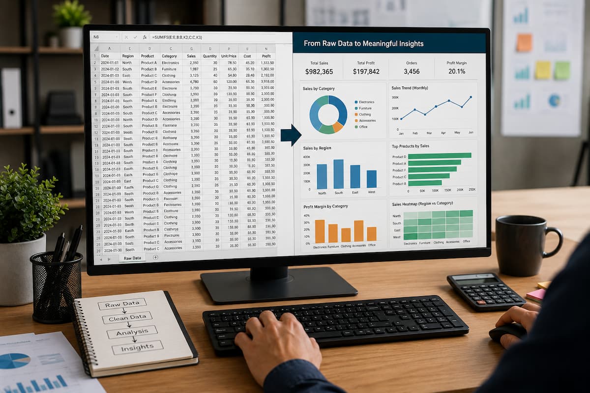
Spreadsheets are great for storing information, but raw data alone doesn’t always provide you helpful answers. A worksheet can be loaded with hundreds or thousands of rows of essential material, but it can be daunting to try and spot trends, problems, and possibilities. This is a problem familiar to business, education, and personal pursuits. A sales spreadsheet might list every transaction you’ve had in the past year, but you’re not going to look at a bunch of rows of numbers and instantly know your best-selling products. But a budget spreadsheet doesn’t immediately highlight where money is being spent, even if it does track every expense.
It’s how you structure, analyze, and present information that turns raw data into valuable insights. There is more to Excel than merely entering numbers. With the right tools, you can turn scattered information into concise reports that help you make better decisions. You don’t necessarily need advanced abilities to turn data into insights. There are a few essential approaches that can yield significant results for many users:
- clearing up messy information
- Properly arranging data
- with analytical expressions
- developing visual reports
- spotting trends and patterns
It’s not about making spreadsheets more complicated. The aim is to make information more accessible.”
Start With Clean and Organized Data
Before analyzing any spreadsheet, the first step is making sure the data is reliable. Many spreadsheet problems happen because people try to analyze information before cleaning it. If the original data contains errors, duplicates, missing values, or inconsistent formatting, the final results may be misleading.
For example, imagine a customer list where one entry appears as
Microsoft
and another appears as
Microsoft
The extra space may look invisible, but Excel may treat them as different values.
Similarly, dates can create problems when they are entered in different formats:
01/07/2026
July 1, 2026
2026-07-01
To a person, these represent the same date. To a spreadsheet, they may not always behave the same. Before you create charts or reports, take a moment to review your data structure.
A well-organized spreadsheet usually has:
- clear column headings
- consistent data formats
- no unnecessary empty rows
- one type of information per column
- no merged cells inside the main dataset
A simple rule is that every row should represent one record, and every column should represent one type of information.
For example:
| Date | Product | Region | Sales |
|---|---|---|---|
| July 1 | Laptop | North | 1200 |
| July 2 | Mouse | South | 250 |
This structure allows Excel tools to understand and analyze the information correctly.
Use Excel Tables to Make Data Easier to Manage
One of the easiest ways to improve a spreadsheet is converting a normal range into an Excel table.
Select your data and press:
Ctrl + T
Excel converts the range into a structured table.
This provides several advantages:
- automatic formatting
- easier filtering
- automatic expansion when adding new rows
- clearer formulas
- easier chart creation
For example, instead of writing:
=SUM(D2:D500)
A table allows formulas like
=SUM(Table1[Sales])
The second version is easier to understand because the formula explains what information it is using. Tables are especially useful for reports that grow over time. If you add new sales records next month, Excel automatically includes them in calculations and charts. A common mistake is creating analyses from random cell ranges. Such behavior often causes problems when new data is added later. Tables help prevent this issue.
Use Formulas to Discover Patterns in Your Data
Formulas are not only for calculations. They are also tools for analyzing information. Basic formulas such as SUM and AVERAGE can reveal important trends.
For example, a sales spreadsheet may show total revenue:
=SUM(D2:D1000)
But you can learn more by comparing values.
An average sales calculation:
=AVERAGE(D2:D1000)
can help answer questions like
- What is the typical order value?
- Are recent sales improving?
- Are certain products performing differently?
The IF function is also useful for classification.
Example:
=IF(D2>1000,"High Value","Standard")
This automatically separates transactions into categories. Instead of manually reviewing thousands of records, Excel creates meaningful groups for analysis. More advanced functions such as XLOOKUP can combine information from different sheets.
For example, you may have:
- one sheet containing product IDs
- another containing product details
XLOOKUP can connect them automatically and create a more complete report.
Use PivotTables to Summarize Large Amounts of Data
PivotTables are one of Excel’s most powerful tools for turning raw data into insights. Many beginners avoid PivotTables because they look advanced, but the concept is simple. A PivotTable takes a large dataset and creates a summary.
Imagine you have 50,000 sales records. Each row contains:
- date
- product
- salesperson
- location
- revenue
A PivotTable can quickly answer questions like
- Which product sells the most?
- Which region generates the highest revenue?
- Who has the strongest sales performance?
- How do monthly results compare?
Instead of manually calculating these answers, Excel creates the summary automatically.
To create a PivotTable:
- Select your data.
- Open the Insert tab.
- Choose PivotTable.
- Select where you want the report.
- Drag fields into Rows, Columns, Values, or Filters.
The power comes from experimenting with different arrangements.
For example:
Putting “Product” in Rows and “Sales” in Values creates a product performance report.
Adding “Month” as a filter allows you to compare different time periods.
PivotTables are especially valuable because they allow you to explore data without changing the original information.
Turn Numbers Into Visual Stories With Charts
Numbers are useful, but visual information is often easier for people to understand. A chart can reveal patterns that are difficult to notice in a table.
For example, a monthly sales table may look like this:
| Month | Sales |
|---|---|
| January | 5000 |
| February | 6200 |
| March | 8500 |
A line chart immediately shows whether sales are increasing or decreasing. Choosing the right chart type matters. A line chart works well for trends over time. A bar chart is useful for comparing categories. A pie chart can show proportions, but it should be used carefully because too many sections become difficult to read. A common mistake is creating charts just because they look attractive. A chart should answer a question.
Before creating one, ask:
“What decision should this chart help someone make?”
If the answer is unclear, the chart may not provide real value.
Use Conditional Formatting to Find Important Information Quickly
Conditional formatting helps Excel automatically highlight important data.
For example, you may want to identify the following:
- low-performing products
- overdue tasks
- unusual expenses
- duplicate records
Instead of manually searching, create a rule.
Example:
Highlight sales below 500:
=D2<500
Excel automatically marks values that require attention. Conditional formatting is useful because it creates visual signals without changing the actual data. When a manager reviews a report, they can quickly identify problem areas without having to read every row. However, avoid using too many colors. A spreadsheet filled with different highlights can become confusing. Good formatting should guide attention, not distract from the information.
Build Simple Dashboards for Better Decision-Making
A dashboard combines important information into one easy-to-understand view. Many professional reports use dashboards because decision-makers often need answers quickly.
A simple Excel dashboard may include:
- total sales
- monthly trends
- best-performing products
- important warnings
- comparison charts
You do not need complicated designs to create a useful dashboard. The most important part is choosing meaningful information.
For example, a business owner may not need to see every transaction. They may only need:
- current revenue
- sales growth
- top products
- areas needing improvement
A good dashboard removes unnecessary details and focuses attention on what matters.
Common Mistakes When Analyzing Spreadsheet Data
One common mistake is analyzing data without understanding the source. A chart or formula can only be as accurate as the information behind it. Another mistake is focusing only on totals. A total number may look positive, but more profound analysis may reveal problems.
For example:
Total sales increased, but one major product category declined significantly. Looking beyond the surface helps you find the real story. Another problem is creating reports that are too complicated. Adding more charts, colors, and calculations does not automatically create better insights. The best reports are usually simple, focused, and designed around specific questions.
How to Improve Your Spreadsheet Analysis Skills
The fastest way to become better at data analysis is to practice with real situations. Instead of learning features randomly, choose a dataset and ask questions.
For example:
- Which month had the highest sales?
- Which products need attention?
- What categories are growing?
- Where are expenses increasing?
Then use Excel tools to answer those questions.
Start with simple techniques:
- sorting data
- filtering information
- calculating totals
- creating charts
Then move toward:
- PivotTables
- advanced formulas
- dashboards
Learning this way builds practical skills that transfer directly to real work.
FAQs
1. Do I need to be an advanced Excel user for data analysis?
No, you can get many useful insights using simple formulas, tables, PivotTables, and charts.
2. Why does my Excel graph show the wrong information?
Misleading selection of data range, data mistakes, and lack of adequate organization of the source data are the reasons for misleading outputs of charts.
3. Do I have to sanitize data before creating reports?
Yes. Clean data first for better accuracy; avoid misleading findings.
4. Are pivot tables difficult for beginners?
PivotTables can seem daunting at first glance, but they’re actually rather simple once you realize that they’re just summarizing lots of information.
5. Can I do data analysis on Google Sheets?
Yes. Google Sheets has a lot of similar functionality, including formulas, charts, filters, and pivot tables.
Conclusion
What you see in a raw spreadsheet is merely the start. It’s about taking that information and putting it into something people can comprehend and use. With the correct methodology, Excel can turn thousands of data points into clear reports, meaningful patterns, and improved judgments. Structure your data appropriately and then apply algorithms, pivot tables, charts, and conditional formatting to reveal critical information.
You don’t need to become a data analyst overnight. You can turn ordinary data into useful insights that can save you time and improve your decision-making by learning to ask the correct questions and using the right spreadsheet tools.